

 Arda Zuber, PhD
Everyone knows not to put everything in one stock. So you hold five, spread across five sectors, each around 1% of the account, and the position list looks like a portfolio.
It is one position, and you find out which one on the day it matters.
Correlations are not constant
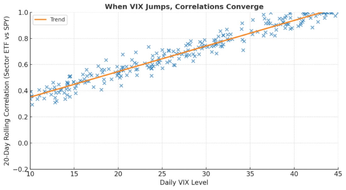
Here is the relationship people assume is stable, plotted against volatility.
VIX near 10 — sector correlation to SPY sits around 0.4. Genuinely different exposures. Your portfolio behaves like a portfolio.
VIX above 40 — correlation approaches 1.0. Everything moves together. The tech name, the energy name and the consumer staple all become the same trade.
The trend line runs almost straight through the middle. This is not an occasional anomaly; it is a reliable relationship, and it runs in the least convenient direction possible.
Why that is the worst possible schedule
Diversification is priced as protection against a bad day. The chart says it works well on ordinary days and stops working on the day it is needed.
In calm markets, when your positions would survive anyway, they are usefully independent. In a spike, when independence is the whole point, it disappears.
You are not paying for insurance that occasionally fails. You are paying for insurance that lapses on contact with the event.
Where this comes from
Wisdom 17 of Live to Sell Another Day: The Seller's Code, which treats correlation as a sizing problem rather than a portfolio-construction footnote.
Live to Sell Another Day on Amazon →
Where this bites premium sellers specifically
Selling options makes it worse in two ways.
You are short volatility across the book. When VIX spikes, every short premium position loses at once. There is no leg quietly gaining to offset the others, because they are all the same trade wearing different tickers.
Margin expands simultaneously. Brokers raise requirements during volatility events. So your positions move against you together and the capital needed to hold them rises together — which is how forced liquidation arrives at the bottom rather than the top.
Measure the driver, not the symbol
Two practical corrections.
Beta-weight against SPY. It translates every position into equivalent shares of the index and produces one number for real market exposure. Five small-looking positions routinely beta-weight into a single large directional bet, and that fact is invisible in a positions list.
Cap by driver. For each position, name what it actually depends on — a rate decision, a tech multiple, an oil price, one macro print. Then limit the driver, not the ticker. Three names sharing a driver is one position for risk purposes, however your statement groups them.
The illusion the old rule creates: 1% in AAPL plus 1% in MSFT plus 1% in QQQ feels like three 1% positions. In a tech drawdown it is a 3% position, and QQQ contains the other two.
The uncomfortable conclusion
You are less diversified than your account screen suggests, and the gap between the two is largest at the moment of maximum stress.
Which means the correct time to fix it is now, in a calm market, when the numbers look fine — because the measurement that would show you the problem only becomes accurate once it is too late to act on.
Keep reading
- Sizing for the loss rather than the win
- Wheeling an index versus single stocks
- Fat tails and the moves models call impossible
OptionsLabPro is a structured options course built on interactive lessons.